
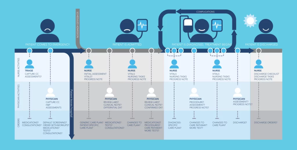
Healthcare customer journey maps often expose pain points and opportunities for improvement in many other areas along the entire user journey – not just as it relates to software applications, but how it relates to patient perceptions, satisfaction scores, and overall customer experience.
Part of creating a ‘sticky’ digital health application that becomes a part of the user’s professional and/or personal life on a daily basis is truly understanding what their daily journey looks like. What do they experience emotionally? What are their highs and lows? When are they busy? When are they unmotivated or uncertain about what to do?
The same rules apply when creating software or applications designed to improve the experience of healthcare consumers. You need a comprehensive understanding of the patient experience. What it looks like, how the patient’s emotional state changes throughout their journey (whether or not they are actively seeking diagnosis or treatment), and how they interact with healthcare systems, providers, and stakeholders.
Bear in mind that he emotional state of end users has a profound impact on their ability to use technology – especially when it concerns a person’s health. If a product hasn’t been designed with this in mind, it will lead to frustration, mistrust, and poor rates of adoption. For example, consider a patient being released from the hospital after a heart attack. The patient faces a long recovery period guided by dietary restrictions, medications, exercise regimes, and a host of warning signs to watch for that could spark a quick return to the emergency room. Typically, upon discharge, patients are briefed by nursing staff, given recovery related reference material, and left to manage their own recovery. This initial period after release is a time of great stress and uncertainty for the patient. An effective digital health application that has carefully considered the entire patient journey, while streamlining how patients interact with healthcare providers, and the health system as a whole, can free up the mental and emotional space needed to heal.
TIP: Three Steps to Successfully Mapping the Patient’s Journey
Here are three well-tested steps to gaining insight into an existing patient journey during the early requirements phase:
- Model your understanding of the existing patient journey
- Present the patient journey model to all those involved in the process. Update the model according to the feedback received. Repeat (as many times as possible).
- Pass the model back to the software designers.
Illustrating the key points and journey of your user in a clear and simple map or storyboard shifts the focus from operations and technology to the customer and explains the emotions behind each one of the actions they take.
What is the Patient Journey?
The patient journey refers to the entire sequence of events (or journey) that a patient goes through, from the onset of symptoms, all the way through to their aftercare and long-term treatment plan. Between this the patient journey map comprises many steps, with some of the most crucial being diagnosis, treatment planning, and the treatment itself.
Note that unlike in many other sectors, the customer journey in healthcare is rarely linear. This creates complications when developing a customer journey map, and designing the technologies to manage it.
What is a Customer Journey Map?
A customer journey map – whether in healthcare or any other field – provides a holistic and graphical overview of the various touch points a customer has with a product or service. It pinpoints potential user experience, security and reliability issues; in addition to identifying the factors at each touch point that may lead to a positive or negative experience. Journey maps help to minimize the odds of these issues occurring during design. They help software designers and their clients understand their user’s experience at each step along the process, while shifting focus from operations to the user and explaining the emotions behind each one of the actions they take.
In healthcare, patient journey maps are used to help healthcare organizations understand the patient journey, including how patients interact with health systems, how care is delivered, and how this impacts patient satisfaction and outcomes.
What value do customer journey maps provide?
Customer journey maps often expose pain points and opportunities for improvement in many other areas along the entire user journey – not just as it relates to software applications, but the process and overall customer service issues as well.
They spark discussions to help close knowledge gaps and provide a point of reference to help fill in information that may be missing in the process. They also help inform valuable design decisions and can act as a catalyst for idea sharing and generation between teams and clients.
From the patient’s point-of-view, consideration of the customer journey map contributes to a seamless patient experience, while enabling them (the patient) to focus on what matters most – their treatment and recovery.
What role does UX research and design play in customer journey map development?
Customer journey maps are created by conducting research on one or multiple end-user personas. This research answers questions like:
- who is your user (in this case, the patient)
- what are their motivations (typically, treatment and recovery)
- what tools or artifacts do they use (this can include everything from an app used to book an appointment, through to the pharmacy, health center or hospital where they seek treatment)
- what are the biggest influences on their experience
- what are their social interactions influencing tasks
Collaborating with your designers at this point is great so that the experience map can clearly show insights, such as pain points and opportunities for improvement. You can also include a few complementary statistics to bring awareness of the patient’s experience. With all of these elements clearly illustrated on the map, it provides something for teams to rally behind to help drive product decisions.
How do customer journey maps differ from other or more traditional forms of UX deliverables?
When done right, customer journey maps combine and visually connect research from multiple areas (like surveys, customer support calls, observations, etc.). Rather than looking at the user in a vacuum, a customer journey map provides a better way to understand a user and the life factors that influence them at any given moment. Customer journey maps are highly actionable documents that highlight insights, pain points, and pinpoint opportunities for improvement.
Four Steps to Building A Patient Journey Map
As you might have guessed, patient journey maps are not a “thought experiment”. You shouldn’t rely on your memory or imagination alone. It’s easy to assume you know what happens during the patient’s journey, especially if you have prior experience, but you may be missing key insights. If you haven’t yet done so, you’ll want to review our article on UX framework for healthcare apps, where we outline a few research methods that you can use to inform your patient or healthcare journey map. If you’ve reviewed the research dimensions and have a good sense of what you want to do, follow our four steps to to mapping the patient journey below. These steps will help you pull together the research elements into a cohesive visual representation of your patients’ experience.
Step One: Map Your Initial Scenario
The first step of a patient journey map is to set down the high- level processes a patient goes through. These need to be fairly large chunks in the journey, to give you space to dig deeper into each section. Perhaps thinking of them as blocks in a flowchart, can help you break it down into the large sections required, then plot them on a large piece of paper, whiteboard, or use a modeling program. Also, consider at this point the multiple stakeholders that your patient interacts with on their journey from their family and primary care providers, through to specialist physicians and surgeons, and even pharmacists. Plot these below and leave space for building on their touch points with the patient.
To help you visualize this, we’re going to work through the example of a woman undergoing doctor-assisted labor and delivery in a hospital.
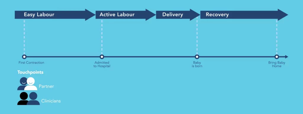
In this particular scenario, we will assume that it is an uncomplicated labor/delivery which is supported by her partner throughout and involves only a brief stay at hospital post-birth. In the initial map outline, we have drawn a timeline outlining some of the high-level stages of labor and associated events and activities. We’ve added in our key stakeholders (partner, clinicians) below and given space to add in further information about them and their relationship with the woman in labor throughout her journey.
Once we have the high-level stages added, we’re ready to delve into our research and understanding of the process.
Step Two: Add Qualitative Data
Typically most designers and developers of applications have some initial understanding of how a user works their way through the application. They’ve either observed the scenario themselves or received documentation of the typical path a user takes from documentation or initial reporting. Adding in additional information from qualitative patient research, such as from an observational or contextual inquiry study, can give more points along the timeline and highlight some critical events.
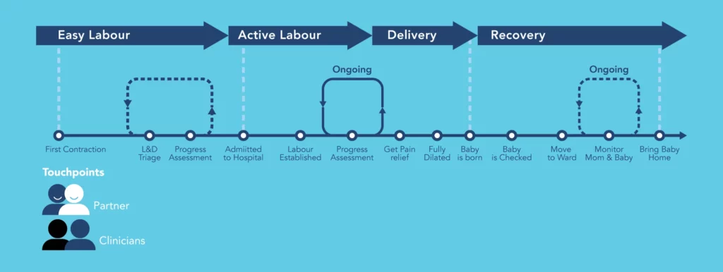
As you can see we’ve added some repetitive loops into our map, showing that what we initially plotted as static activities on the map, actually can be highly repetitive steps. This can impact data collection, as you will have to allow for multiple recordings of the same data within your application. Observation exercises can also help gather insights into the touch points that our user has with a partner, clinicians, and friends and family. Above, we’d forgotten to add friends and family, but as we’ve moved through our research in the field, we’ve seen how their interactions impact the user. We’ve also decided to conduct interviews with our persona to gather more information on the emotional highs and lows they are experiencing to better incorporate the patient’s experience into our map.
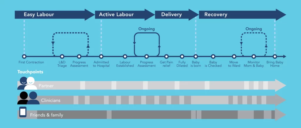
Once we’ve conducted our interviews, our additional research can be plotted. We’ve added friends and family and their touch points and colored the map to represent the patient’s highs and lows. Typically pain levels are gauged at different intervals and they can provide good insight into what a woman is experiencing, these are mapped in grey.
Interviews can provide additional insights, such as adding the loop at the beginning to show how an expectant woman might be sent home from the hospital if her labor is not advanced enough. You can also get access to insights on her thoughts, questions, and opinions about her birth experiences. Because this research technique is semi-structured or unstructured it gives the interviewer the opportunity to probe for additional information helping them to identify pain points and gather valuable patient feedback. This can help you refine your phases and milestones, and design a patient journey map that improves healthcare quality, delivers better clinician/patient interactions and increases patient satisfaction scores.
Remember: While contextual inquiry and interviews offer great insight into the process, it is not always appropriate. In our scenario, tracking our user in context and conducting interviews during the process is probably not the best idea. Consider your scenarios and choose an appropriate research technique that can deliver the data you need while respecting the user.
Step Three: Add Quantitative Data
Quantitative research and data is essential to scaling the creation of patient journey maps. It’s great for adding in relevant supporting statistics and analytical data and it allows you to move past one or two observations/interviews and conduct broader research to get a sense of how the experience of your persona translates on a larger scale. A survey may give us the related information we need to answer the questions: How many? How much?
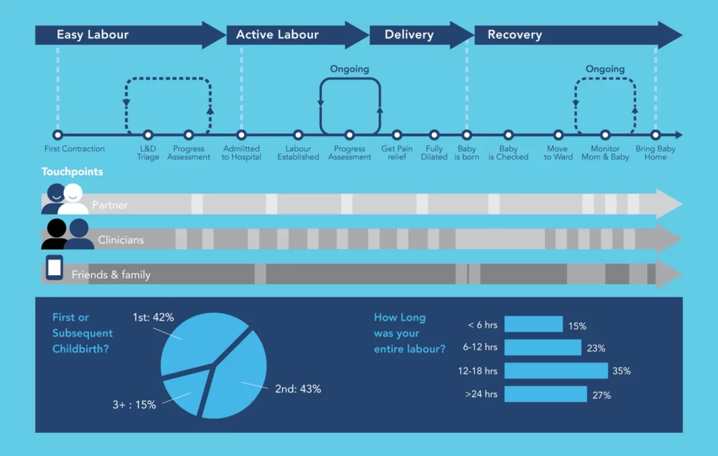
At this point, we’ve added some related survey statistics to the bottom of our map – e.g. how many children the mother has had.
Step Four: Final Review and Clean Up
Once you have conducted all of your research and fleshed out your map with the relevant details and information, you may find that the map is overwhelming and not really highlighting a particular solution. It may look nothing like ours. Particularly if your journey map has a large number of touch points, it becomes hard to highlight every touch point on the map. The map can become too cluttered and lose focus and meaning.
Take some time to carefully decide what you’d like your map to highlight. Then consider what is irrelevant to that journey and remove it from your map. Get feedback, review, re-map, and review again.